Infographics are hot right now, and I couldn’t be happier. Data visualization has always been fascinating to me, so much so that I was featured in FastCompany Magazine in February talking about how much I love it. (Yeah, I know. Pathetically shameless plug. Get over it.)
Anyway, the tech job market is booming right now, thanks to Bubble 2.0, but there’s still a lot of competition out there. You’ll still have a great advantage if you make your résumé stand-out among the rest.
As I was helping a friend freshen up their CV, it struck me that an infographic could actually be an amazing format for a résumé, especially for techs and creatives.
Think about it – all that boring-ass text on your résumé? What’s it actually trying to convey? Timelines, levels of experience, focus of activities, weighting of strengths, etc.
All of which can really be distilled down to raw data and expressed in a chart or graph.
And if you suck at design, that’s okay too. Check out Infogr.am, which is my new favorite thing in the whole world.
Infogr.am lets you drag and drop awesome-looking charts, graphs and maps into a create-your-own-infographic format that makes it dead-simple to come up with slick designs using just the data.
To put it in perspective, look at my summary/intro thing:
Hi, I’m Alison. I am an IT Generalist with over 17 years experience in technology. I started off as a PHP/MySQL developer and over time my role has transitioned more into an ops management position. I code a lot less now, but I still get to solve really interesting problems, so I’m pretty happy with it.
In a typical day, I might be be architecting the caching component of a high-availability, high-traffic (~1MM hits a day) systems, setting up unit tests in the continuous integration system, twiddling DNS, or performing a penetration test against a milestone release. Or I might be fine-tuning Percona MySQL for optimal performance under load, determining a company-wide OS upgrade path, or developing a disaster recovery/business continuity plan for a system.
I wear a lot of hats, but that’s kinda how I like it.
What am I actually conveying there? A high-level timeline of what I’ve done and when I’ve done it, and what percentage of my time might be spent doing certain things now.
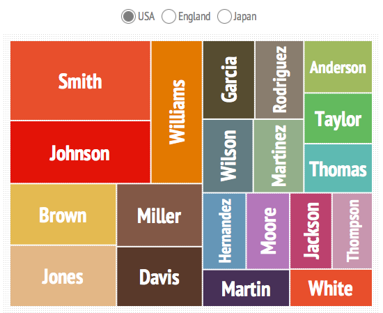
Same goes for skills. By using a tag cloud or treemap, you can convey not only the names of the skills, but also your experience with them, since you decide what size they appear (and therefore how heavily weighted they are.)

And Infogr.am lets you create several panes, so you can split your treemaps up by years, speciality, etc. For example, here’s something I whipped together quickly. The values in the treemap and aren’t correct or anything, but check it out here, and click around:
A Few Tips
If you’re having trouble converting text content to a graph or chart, keep at it. There’s not a lot you can say in text that you wouldn’t be able to say using data. If you’re tempted to write text that isn’t a chart headline, stop and really think hard about whether there’s any way to represent what you’re trying to say as data.
If you use Infogram and embed the script into your résumé website, be sure to provide a link to a text version as well, so you don’t lose search engine juice. Also make sure you have a printable text version. While you may knock the socks off the Creative Director you meet with, HR might not be so visionary.
And finally, if you use sectioned charts or graphs (splitting up your treemap by year for example), be sure to make the current year the default year that displays before interacting with the infographic, since it’s going to be the most relevant.
Not Job Hunting? Teambuild Instead!
One thing that always seems like a challenge when working in a team of creatives or developers is to keep an inventory of each person’s strengths and interests.
Strengths are obviously important, since knowing what each of your developers is particularly good at will help you resource well – but interests are also important, so that you can work towards giving your devs the opportunity to expand their skills and play around in some of the cool new tech they’re interested in.
Each member can make their own infographic and then take a few minutes to share with the rest of the team. You could even print them out or have them all side-by-side on a screen or a wall somewhere, using the combination of infographics as a beautiful way to show off team skills.
Wrapping Up
Using an infographic can be a great way to quickly convey information you want a perspective employer to know about you, and it also shows that you have the ability to balance creative ideas and technical concepts and data. You’ll come across as versatile and innovative – and a little bold, for daring to break the standard, boring résumé conventions.
If you decide to give it a try, be sure to share your results in the comments!
Image source: Visual.ly