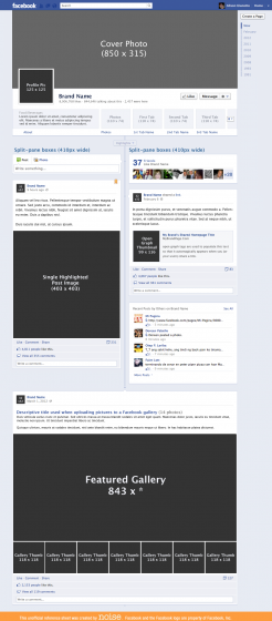
Facebook rolled out their new Timeline for fan pages about a week or so ago, and you’ve got less than a month to transition your fan pages over before Timeline goes live for all fan pages on March 30, 2012.
Timeline for fan pages is, in general, one heck of a step up.
Overview of Changes: First, the Good News
- Giant, sexy cover photo at the top of your page
- Pin important messages to keep them at the top for 7 days
- Highlight posts or photos to give them huge screen real estate
- Users can send private messages to a brand from the fan page
- Navigation (app tabs, photos, etc) moves to the top of the page
- Add Milestones to tell the brand’s story from the beginning
- Admin panel for page admins shows activity summary, tools and tips
- Premium ad types – sponsored stories on steroids
- New “Offers” content module lets you highlight deals and specials
- Facebook insights goes real-time in the next few weeks
- Application tab size expanded to a hefty 810 pixels
There are (as always) a few gotchas.
- Default non-fan landing pages go away. All visitors to your pages see the Timeline view.
- Only 3 app tabs visible below cover photo
- Maximum of 12 applications (including FB’s photo app) total
- ALL pages will be transitioned automatically on March 30, 2012.
I created a mockup in Photoshop with the new image dimensions that may be helpful to some folks. Click on the image below to view or download a larger view, or grab the PSD file for your own use. (If you use the template for public distribution, please leave the credit footer intact.)

And you can also check out the deck I created for our clients. It’s not quite as sexy as I usually like to make client-facing assets, but it’s hard to make screenshots look sexy.
The deck goes into a little more detail about the individual key features bulleted above. If you’d like to share it, you can grab a PDF version here.
Cover Photo Restrictions
The huge cover photo is arguably the most noticeable change to someone who first gets to your page, however you should know that there are some restrictions on what you can put in that cover photo (besides the usual FB content policy restrictions).
NO events or dates, no calls to action, no prices or specials (FB wants you to use the new Offers app for that), and no contact information or references to other elements or apps on the page.
It’s worth it to take a peek at the updated Facebook page policy guidelines to make sure you’re in the clear.
You can, however, do some fun and creative designs that visually tie your cover photo into your profile pic or your application tab images. A neat example of this is how Livestrong has handled their cover image. See how the lines “continue” down into the application tab thumbnails? A little creative thinking can make this a beautiful and unique canvas for your brand.
Only 3 Application Tabs
“But Snipe, how do we drive traffic & engagement to application tabs that aren’t one of the chosen three?”
Although it seems like Bad News that there will be fewer visible application tabs on your page, most users have been finding their way to those tabs through generated stories, likes and comments from friends.
They key to your continued success with your Facebook application tabs is to focus on generating meaningful stories that will inspire their friends to engage.
It sounds awful, and may lead to some in-fighting within your clients as to which department or project gets those top three tabs, but if you think about it, most people haven’t been using the side-tab navigation to get to your tabs anyway.
My advice to you would be to let them fight it out internally. Work on making your application tabs as awesome and compelling as possible so that people want to share it with their friends and their friends want to click through and interact with your app.
Try Before You Buy
Luckily, Facebook makes it pretty easy to preview your page and make the necessary cover photo changes, etc before publicly pushing your page to Timeline. You can easily see a list of the Facebook pages you admin, and a quick preview of what they’ll look like in their current state.
What Do You Think?
Have you transitioned over to Timeline for your pages yet? What have been your experiences? I’ve found that some users are grumpy about how their posts are aggregated on the new timeline, but overall I’m pretty happy with the move.