This is part one of a series – the technical how-to of creating the application will be discussed in a separate article. This article is intended to help you plan out your application to best prepare for coding and best leverage the new aspects of Facebook for exposure and social interaction.
[box type=”warning”]This post was written in 2008. The Facebook API has changed dramatically over the past several years, and some or all of the technical information in this article may no longer apply. FBML and FBJS have been deprecated for quite some time now. I’m keeping the article for historical purposes, and because there is still some useful insight with respect to how to approach virality, social sharing and application design, however it should largely be considered out-of-date and less useful than more recently authored articles.[/box]
Having created several Facebook applications, I had this article in the back of my head for quite some time now.
The code and Facebook functionality mentioned in this series is current as of September 26, 2008, and deals primarily with the “new” Facebook. I will try to keep it updated in the future as they continue to change things.
The planning phase is absolutely critical and directly relates to the success of your application. This is especially important in Facebook applications, since good planning can literally make or break the popularity of your application. If you overlook one of the profile boxes, or fail to implement social actions such as inviting friends or posting actions to the user’s newsfeed, you’re going to lose out on some of the key viral aspects that make Facebook applications become popular in the first place.
Application Canvas Page
The application canvas page is the standalone page that your application lives on. It has the widest available page real estate, since the application doesn’t have to share the page with anything else, other than a narrow column of ads on the right-hand side (not shown).
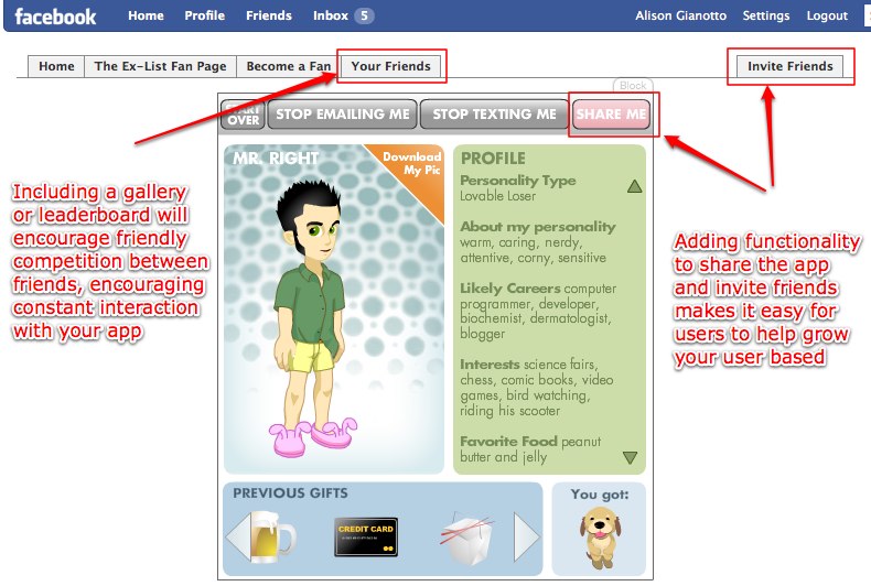
You can use a few built-in features of Facebook’s scripting language, called FBML, to easily create the ability for users to invite their friends to the application. We’ll go into more of the built-in tab tags in the next article, but its important to make it easy for users to get their friends engaged. Here’s some sample code:
(code removed, deprecated)
NOTE: Never require that your friends invite people in order to use your app. It’s lame, and although it may boost the number of people who install the application, your number of active users will not benefit as much as if you use honest methods to encourage people to involve their friends. Its a lousy business practice, and you will drive away users who don’t enjoy being forced into spamming their friends with an application that they haven’t even been able to try yet.
Genuine, organic interaction is what will provide you with long-term active users, not underhanded tricks. When users trust your application, they will be more likely to stay active and invite all of their friends, instead of just the ones they are required to invite to check out your application.
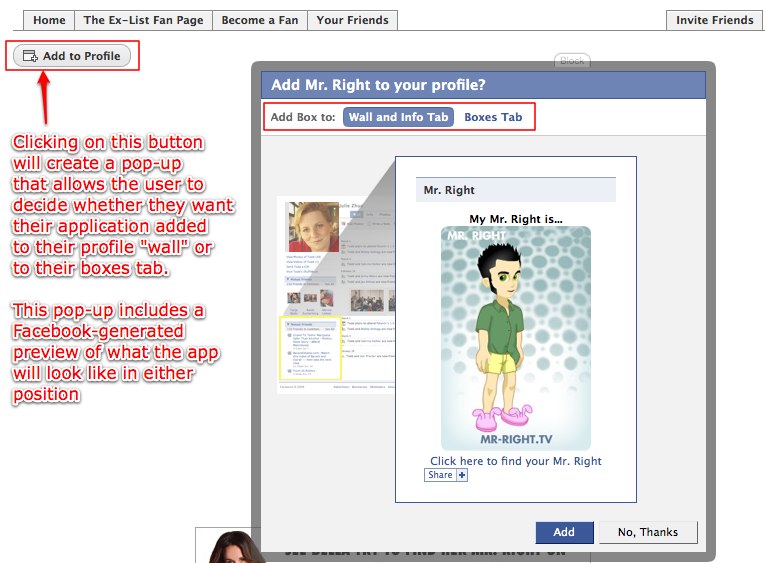
Since FBML will also allow you to deliver specific content based on whether or not the user has added your application to their profile or boxes page (discussed below), be sure to include a button that prompts the user to add it. Many users are still confused by Facebook’s new layout and functionality, so the easier to make it for people to add your app to their profile, the better.
To create this button, simple include the following code where you want the button to appear:
(code removed, deprecated)
Application Content Boxes
Let’s get started by discussing the various places your application content can live on Facebook. The main application lives on a canvas page in Facebook – that’s the page at http://apps.facebook.com/<yourappname> – but that’s not the only place your application can appear. There are several content boxes available to you – or more specifically, to your potential application users – and each one serves a slightly different purpose. To further complicate (or arguably improve) matters, the content you deliver in those boxes can be customized for the user who has added the application AND for a user who is looking at the box on someone else’s profile or fan page, delivering specific content for each state.
1. Application Profile Boxes – Old Vs. New
Application profile boxes are the boxes where your application has a presence on the profile of the user who has interacted with it.
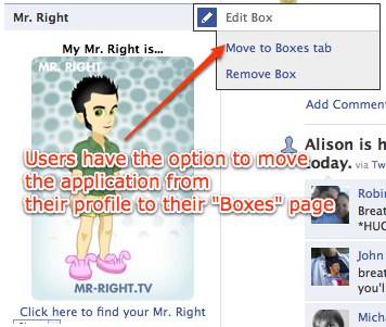
With the “new” Facebook launch, the location and specs of these boxes have changed drastically. Prior to the Facebook redesign, when a user added an application, it would appear on their profile page, either as a wide box or a narrow box, depending on the application settings. Users could move the box from its default location into the opposite column if they so chose. When a user added an application, the application’s profile box would show up by default in the user’s profile. They always had the option to remove the box, but it showed up by default.
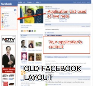
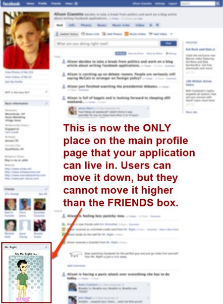
This layout has since changed – in fact, if you use Facebook at all, you’ll have noticed that the entire profile layout and interface has changed. The change has resulted in a reduced presence of applications on the profile pages. On the new Facebook, users no longer “add” an application, they “allow” it – and the application doesn’t show up anywhere in their profile without them deliberately going out of their way to add it. This means that you have more of an obligation to give the user a compelling reason to add your application to their main profile page.
Additionally, the old wider boxes in old profiles are no more. Profile application boxes are 200 pixels, with 8 pixels of padding on each side for an actual usable width of 184 pixels – and are limited to 250 pixels in height. If your application box is longer than 250 pixels, everything below the 250 mark will be hidden from view, so plan around these dimensions.
If your application is created properly, the user will also have the option to move the application box to their (new) “Boxes” screen.
2. User Profile “Boxes” Screen
The new Facebook includes a tab labeled “Boxes”, that serves as a shortcut to the applications they choose to include in that area. Applications that the user frequently interacts with might be added here, so the user can get to them quickly. Users can opt to drag their box to the wide or narrow column in the boxes screen.
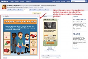
Because the user has the option of narrow or wide, you should make sure you account for both wide and narrow views for the boxes tab. As you’re designing your application, take into consideration that there are dramatic size differences between the wide and narrow layouts, and design appropriate displays for both versions.
3. Fan Pages
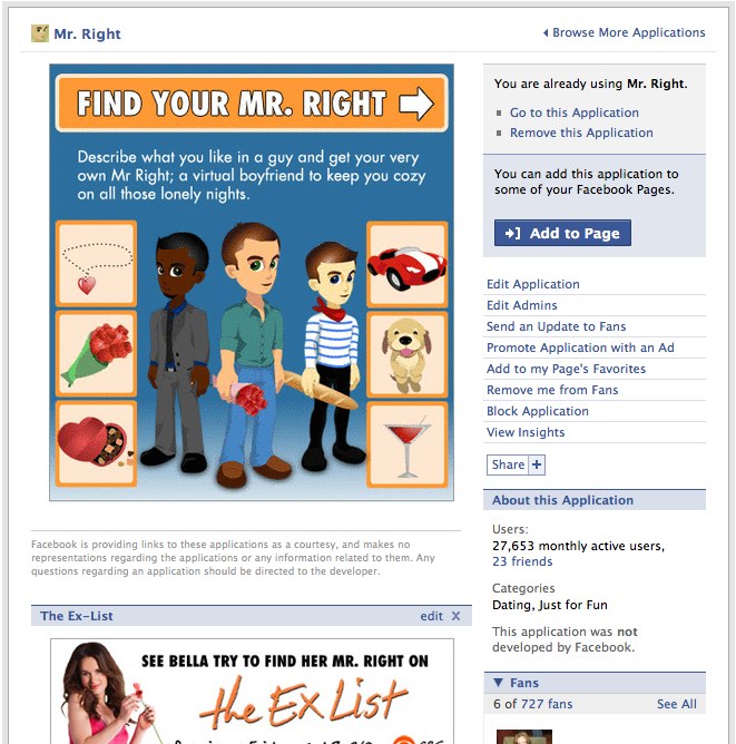
Fan pages and application pages also received an overhaul in the new Facebook design. Previously, application’s “about” page – the page that shows the user information about your application, the developers, and allows users to leave reviews of your application – did not allow you to add external applications to an existing application about page. The new design allows you to do so. Previously, if you were running a marketing effort that included a Facebook application to advertise a product or event, you needed to create a separate fan page where users could upload photos and video, “fan” the page, and so on. Because Facebook has changed this format to allow application administrators to add external applications to application fan pages, you may decide to use the application fan page as the one destination for fans. This can cut out confusion on the part of the user, who may not understand why there are two fan pages for the same product or service.
To encourage engagement, you can enable discussion boards, reviews, photo and video galleries, wall posts and more, allowing your application fan page to be a community portal for the people who interact with your application.
4. Application Tab
In the new Facebook, users have the option of adding a shortcut to their favorite apps right on their profile. This allows them to jump right to the application, without having to dig through their application menu. You MUST set this option up in the application settings page. (It will ask you for a url for your tab page. If you leave this blank, the user will not be able to add your application as an application tab.)
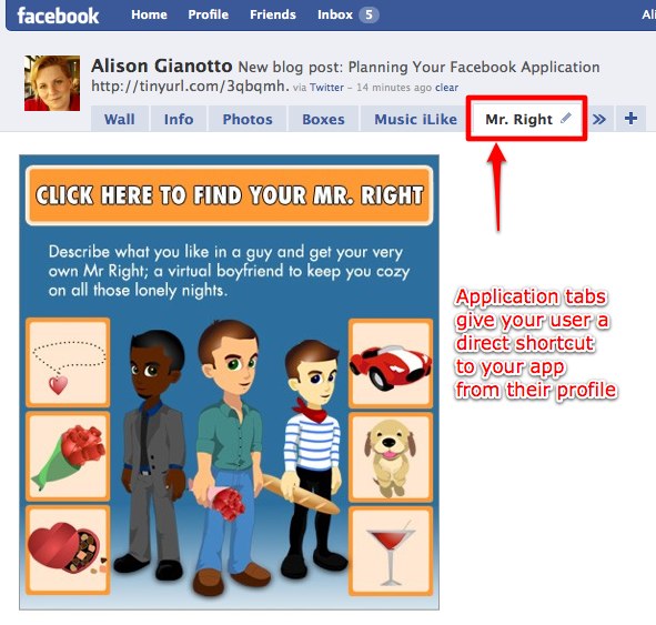
The contents of the tab page (for example, tab.php) are not unlike the contents of your main canvas page. No special code is required, so you can basically just copy the code from your canvas page (minus the wide and narrow specs) and echo it out to the page.
Social Actions
The user’s mini-feed (or newsfeed) is a critical aspect of your Facebook application. Many people never browse the application directory, but instead primarily learn about new applications solely by seeing what their friends are interacting with. Some will be more apt to accept a direct invitation, and others won’t even need an invitation. They will see social actions posted to their friends newsfeed, and if they are compelled by the action or message, they will frequently add the application based simply on the fact that their friends are using it, and they trust their friends, so “it must be good”.
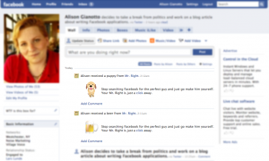
Social actions are displayed on the user’s profile “wall”, and also in the mini-feed page of their friends.
Facebook does have some restrictions on social action messages. For example, every application is limited to 10 social newsfeed messages per user per 24 hour period. If the user interacts with your application in a way that triggers newsfeed messages more than 10 times in a day, the subsequent newsfeed messages will simply not be displayed.
Additionally, the user must take an action that triggers the social action newsfeed item. For example, you could not have an application that adds a newsfeed item every 4 hours regardless of whether or not the user has interacted with the application that day. In the Mr. Right application, which was the source for many of the screenshots in this article, we wanted the fictional “boyfriend”, Mr. Right, to send the users gifts. Those gifts would then be inserted into the user’s minifeed, encouraging social actions. However since it would be against the Facebook terms of service to automatically fire off newsfeed items, we had to create a button in the application that allowed users to request that Mr. Right send them a gift. When they clicked on the “Let me give you something” button, the newsfeed was allowed, since the user took a specific action in the application to trigger it.
When planning your newsfeed items, be sure to make them interesting, relevant and FUN. If users feel as though your application is spamming them or their friends, they will be quick to uninstall it and never look back.
Conclusion
So in conclusion, there are a total of 6 application views you should be planning for:
- Widest – application canvas page
- Narrow – profile box (184 x 250)
- Wide – boxes tab (380 wide, can expand in height)
- Narrow – boxes tab (184 wide, can expand in height)
- Wide – fan page
- Widest – application tab
Additionally, each of these application views can deliver content based on:
- Whether or not the user has added (or “allowed”) the application
- Whether or not the user has added the application to their profile box
Ideally, you’ll want to tailor each of the box view variations based on the user states mentioned above. This potentially means designing 12 different box display variations. This may seem like a lot of work, however by taking the time to plan this out in advance, you’ll be sure to deliver truly tailored content to your users, making it more compelling for them to interact with your application and add it to their profile, putting it in a place where their friends will see it.
Customizing the view will deliver meaningful messages to users who have already allowed the application, and perhaps more importantly, can deliver a call to action for users who haven’t. For example:
- The user who has allowed the application will see a leaderboard of their friends, or information directly related to the way they have previously interacted with the application. (“Friends Leaderboard”, or “This is your Mr. Right”)
- The user who has not allowed the application and is viewing it on a friend’s profile will be given a call to action. (“To get your own Mr. Right, click here”)
Including social actions into the user’s newsfeed will also be a very effective way to leverage the viral aspects of Facebook applications. Carefully planned social action messages will pique the curiosity of the friends of the user who is interacting with it, making it far more likely that they will interact with it themselves.
And of course, you should make it as easy as possible for users to invite and engage their friends by integrating built-in “invite your friends” functionality, and (if it makes sense for your application) leaderboards or galleries that invite friendly competition between friends.
For more information on application planning, visit the Anatomy of an Application page on the Facebook Developer’s website. The Anatomy of an Application page also addresses some additional functions such as a media publisher that allows user to publish rich content to their profiles, although it may not be appropriate for all applications.
Don’t miss part two of this series, where we walk through creating a simple Facebook application based on the dicussion in this article.
