I’m a planning whore. It’s true. I’m one of those weirdos that really enjoys creating data flows, use cases, wireframes, and functional requirements documents. My bizarre predalictions aside, wireframes are a critical part of planning any website or web based application.
Spending the time to plan your project out well at the very beginning may seem like a luxury your timeline and budget can’t allow, but most people realize pretty quickly that failing to do so often ends up costing exponentially more time and money towards the end of the project, when you have exactly none of either to spare.
Scope starts to creep, or features and interface challenges that hadn’t been thought through before are suddenly at the center of a series of critical and rushed decisions that have to be made. This means that you (and/or your crew) are stressed, and because you’ve run out of time and money, you end up having to cobble something together that works as a compromise, but doesn’t stand up to the caliber of work you pride yourself on creating.
For those of you who have been reading this blog for many years, you’ll recognize the tune I’m singing. I constantly harp about planning and documenting. My love affair with planning and documentation isn’t just because of that head injury I suffered as a kid – its because I’ve been fucked over so many times and on such a grand scale in the past when I (or my client/manager) have decided to cut corners and just “crank it out”. While the “crank it out” method may work sometimes, the times that it fails, it fails hard, at the expense of time, money, quality and developer sanity.
Okay, I’ll get off my soapbox. For now. </rant>
So, wireframes. I’ve done them in just about every application you can imagine. Visio, Smartdraw, Omnigraffle, even hand-drawn – you name it, I’ve probably tried it. I’ve been on the eternal quest for the perfect wireframing solution, but I’ve always been left wanting.
But What ARE Wireframes?
Wireframes are a graphical representation of a website or application that help illustrate the user interface without the clutter of stylized design elements. If you skip the wireframe process and go right to Photoshop comps, the client can often get so hung up on the fact that they want that button to be blue with rounded corners instead of green with a square corners that critical elements in the UI can be forgotten altogether. Wireframes let you plan through the user interface elements that are required for each screen in a barebones, no-frills manner.
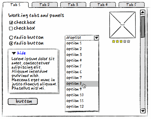
I’m a big fan of sketchy wireframes, especially in the beginning of a project. I find that if you go to a client with something too polished, they perceive it as a structure that has been decided upon, even when that’s the furthest thing from the truth. The sketchy styled wireframes have a hand-drawn, loose feel to them that seems to better communicate that it’s a discussion, not a decision. By avoiding a polished, rigid wireframe, I have found that clients are more able to understand that what they’re looking at isn’t meant to represent the finished design.

I used to hand-draw my wireframes – but the obvious challenges there is that if a change is made to an element that appears on many pages of the site, you now have to re-do all of those drawings. Another disadvantage to pen and paper wireframes is that you have to write a crapload of code if you want to extend the drawing into an interactive format where the client can actually click on elements and see how they behave.
Evolution: Easy Prototyping
More recently, I had found a few apps that were a lot closer to what I was looking for. Balsamiq Mockups is a great application that has a gorgeous sketchy style and a great library of user-contributed downloadable interface elements, so just about every imaginable interface element is available for free download once you’ve purchased the product. More interestingly, Napkee is a commercial addon for Balsamiq that allows you to export your wireframes into HTML (with jQuery) or a Flex file, turning static wireframes into a prototyping tool with very little additional work. Neat!
Unfortunately, Napkee ended up being a little buggy sometimes, and perhaps more importantly, Balsamiq doesn’t natively support Master templates yet. So once again, when a change was made to the main site navigation, I’d have to go in and edit 30 files instead of being able to update a Master template and have those changes reflected across the boards.
Another drawback is that Balsamiq does not support the ability to switch back and forth from sketchy style to straight lines. In my workflow process, what I wanted was to be able to do the rough sketchy style wireframes in the beginning, update them as needed, and then be able to click a button and convert them into a more polished, final-looking set of wireframes that I could hand over to the graphic designers with a client sign-off.
A later contender, Flairbuilder, looked like it might be the answer. It does support the ability to toggle back and forth between sketchy and regular line styles, however the sketchy-style lines somehow didn’t look as nice as Balsamiq’s, and (this is the big one) in order to show the client a working prototype that was created with the desktop version, you had to export the file and then ask them to download a proprietary viewer. Fuck that noise. Half my clients are still on IE6 for chrissakes. I’m not asking them to download anything. So back to Balsamiq I went. Until now.
The Next Generation
Enter iPlotz. I like it already because the name makes me think of a pixelated rabbi pitching a fit. What are their next product lines going to be, the iKibitz and the iSchmaltz? HAH! I’m hilarious. But probably more importantly, it fills in the gaps that Balsamiq+Napkee and Flairbuilder couldn’t – and even adds some great project organization, management and collaboration tools in to boot.
The interface is pretty intuitive, and they have a nice library of elements from which to choose – plus, like Balsamiq, they have a public repository of snippets and projects available for download to fill in the gaps. Like Balsamiq, iPlotz has both a web-based version and a desktop version. The desktop version is a must-have for me, since I spend a hideous amount of time (4.5 hours a day) commuting through mountains where I have no connectivity.
What’s Awesome
- Works on PC, Mac and Linux. (I normally despise AIR applications – but it works here. Nicely executed.)
- Support for Master template files. If our main app nav or layout changes, change it once and it automagically updates on all the pages using that Master. HUGE time saver.
- Send work you created in desktop client to your web account, so you can do a lot of the work wherever you want and then upload it when you’re ready to use the collaboration tools.
- Toggle between sketchy-style, Mac skin and PC skin, great for rough mockups and then converting to polished final versions with just a click.
- Export PDF list with thumbnail of annotated elements an annotations, perfect for an organized breakdown of more specific details on each element. LOVE this – didn’t know I wanted this feature until I found it here.
- Online collaboration with others, allowing clients and co-workers to add notes and comments right into the file.
- Detailed version history.
- Built-in task management system with milestone, great for organizing work on large projects where tasks can get lost.
- Export wireframe pages as PNG.
- Share the HTML prototype on their server, or export to ZIP file and upload it to your own.
- One-click grid overlay.
- Easily embed the prototype in your own websites.
- Easily create or import additional UI elements from user contributed snippets.
- Properties menu lets you specify exact pixel dimensions for every element if needed.
- Separate menu of iPhone UI elements (Android coming soon).
- Automatic site map generation.
What Needs Work
Of course nothing is going to be perfect, and iPlotz is no exception. Here are a few of the things that bug me, none of which are even close to being deal-breakers in my world.
- Hotkey mapping is a little wonky in some browsers, but that is more an artifact of AIR/Flash than it is iPlotz, I think.
- Some elements do not maintain the same sketch style. For example, the module-style widget has rounded corners, which is inconsistent with the rest of the sketchy style’s squared corners. I also feel it is introduces a level of graphic design that I specifically wish to avoid by using sketchy frames. I have only noticed this on a handful of elements, however, and I spoke to iPlotz founder Mark Vernon today and he assures me that properties like that will be customizable in the near future.
- Element library isn’t as extensive as Balsamiq, but user-contributed snippets seem to be on the rise
- I didn’t see any way to save a frequently used imported snippet to your element library so you can get to the easily for future projects. UPDATE: Mark informed me that they’re going to be pushing out this functionality in one of their next releases. I’ll be checking it out on their staging server.
My Demo
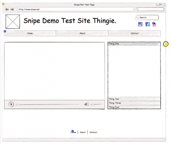
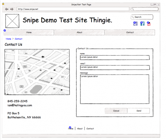
In order to give it a fair review, I decided to whip up a small set of mockups, both to give me an idea of what the UI is like, and to be able to show you some “finished” products.
For client deliverables, in addition to the fancy shmancy working protoype, I can easily export single wireframes (using the sketchy style, the Mac OS style or the PC style):
Or I can export them all into one PDF [PDF link]. And this is my favorite part – the bit I didn’t realize I needed until I had it – I can generate a PDF that contains only the elements in the pages that have annotations [PDF link]. This is fantastic because it allows me to explain any special considerations around specific elements in great detail without cluttering up the wireframe itself. I normally have to manually create this documentation, so this feature alone has just saved me hours of repetitive work.
Another Potential Option. Sorta.
Another interesting contender is ProtoShare. It looks to have a lot of the same functionality as iPlotz, with online collaboration, version history, project management elements and easy prototyping, however their product is web-only, which I’m not crazy about, and their free demo required a credit card, which I can’t stand on principle.
[box type=”success”]The free trial is supposed to woo new clients and get them on-board and buying as quickly as possible – asking for a credit card number just so someone can try out your software is a little sleazy, as if you’re hoping I’m going to forget to cancel and you can suck me for at least a few bucks before I get around to it. If your product is good and brings value, I will buy it. Don’t force me. Dick.[/box]For me, web collaboration might work fine for my personal web clients, but some of the clients we have at the agency I work for have strict rules about online collaboration in apps that do not live on our server or theirs, so my particular circumstance might limit the times I can use the collaboration in a practical situation.
The price points on ProtoShare is also a little higher. iPlotz starts at exactly free, albeit with a very limited plan, only 1 project, max 5 pages. The next plan is $15 a month (although the best value seems to be the yearly plan of $99 which comes with a license for the desktop version), whereas ProtoShare starts at $29/month with restrictions on how many people can review/collaborate. Who knows – it might be worth the extra scratch, but I hate using web-only tools, and I’m not going to give them my credit card information just to try out a demo. You can compare their prices in more detail here: ProtoShare vs iPlotz. When they come out with a desktop version, I might be willing to check it out. I don’t see any option for the sketchy-style mockups in ProtoShare either though, which is another negative in their column.
But hey, don’t take my word for it – check out the video demos on both sites and download iPlotz. I’m curious to know what you think.
Note: The title of this article refers to “cheap”. While to many people, “cheap” might mean “free”, I consider ~$99 a year a reasonable price for such a flexible tool that is such an important part of my job, especially since Balsamiq is $79 and Napkee is $49, so you’re spending that much even if you go the “cheaper” route. Seriously, you spend more than $100 on Starbucks (or whatever corporate coffee swill you’re into) a month, and I spend more than that on hookers and blow in a single week. You can also buy the iPlotz software outright without the web collaboration, which ends up being about $80 for a one-time purchase.
So that’s iPlotz. I’m a now paid member, and I’m very happy with what they provide. Plus, in talking to Mark today, it sounds like they’ve got more very cool features coming down the line soon.
What prototyping/wireframing tool do you use? Let me know in the comments!
Header image credit: Boozer Experience

