I know I promised you that we’d get into some code in the next part in this series, but the article is coming out much longer than I anticipated, as I expect it to be one of the most thorough articles out there regarding Facebook application design. Part two of this series will walk through designing a real-life Facebook application – one I wrote specifically for this article series.
[box type=”warning”]This post was written in 2008. The Facebook API has changed dramatically over the past several years, and some or all of the technical information in this article may no longer apply. FBML and FBJS have been deprecated for quite some time now. I’m keeping the article for historical purposes, and because there is still some useful insight with respect to how to approach virality, social sharing and application design, however it should largely be considered out-of-date and less useful than more recently authored articles.[/box]The first article discussed what features and screens you have available to you in Facebook apps in general – and in this article, we’re going to go through the process of actually planning a real one. You’ll see some pitfalls and hopefully learn to think about your applications in a new, more complete way, harnessing all of the aspects of Facebook’s platform.
Although we won’t be delving into code in this article either, I strongly encourage you to read this article (and the previous article, if you haven’t yet) for your own sanity’s sake. For all the frustrations that come with writing Facebook applications, I can say from experience that at least 75% of my frustration was a direct result of devoting enough time towards the planning phase of each specific application. Plus, the application we spec out in this article is going to be the base that we use in the next part – the one where we actually do start touching code. That article is about 60% written, but breaking it up makes far more sense, since you SHOULD be planning your applications before you start touching code anyway. I promise you, getting this part right will save you days, if not weeks, of re-writing code and fixing issues. I’ve done it. It sucks.
Determine the Social Action Points Before You Start Development
One thing I have learned with regard to Facebook application development is that its very easy to rush into development and inadvertently miss some key integration and social action points. It’s easy to do, since they are not “visible” as you’re developing the app. When the user interacts with your application, you may forget to consider all of the potential notifications that can be triggered, because you can’t physically see them. Out of site, out of mind means that you’re throwing them in haphazardly after the app is built, or worse yet, not using them at all.
“Invisible” (but very important) things to consider are:
- Newsfeeds – when a user directly interacts with your application, you can post that action to the user’s newsfeed.
- Email notifications – if a user has permitted your application to send them email, you can send plain text or (limited) HTML emails to notify them of action items
Newsfeeds are an absolutely critical part of your Facebook application, so spending a little time planning what actions a user can take on each screen of your app is a great start. The actions the user takes that are entered as newsfeed items are prominently visible on the user’s profile page, and will be visible to their friends on the Facebook “home” page that shows recent actions friends have taken.

The main goals of your newsfeed items should be to highlight worthy user actions – the benefit of this will be that the user’s friends see these newsfeed items and may be interested in checking out your application.
Emails are important, but since your users must opt-in to receive them, you may not reach as many people with them. Still, its important to plan them out the same way you plan newsfeeds.
As we go through the sample application, we’ll figure out where newsfeed items would be appropriate. Each application is allowed x number of newsfeed posts per user per day, so you want to choose them wisely and make sure they are truly relevant and not spammy. Each application’s cap is different, and that number changes based on the way people interact with it, but applications start off with around 20 max newsfeed posts per user per day. (This can make testing a bitch, which is another reason its important to get them into the application early in development.)
Also bear in mind that Facebook’s newsfeeds MUST be triggered by an action the app user has taken. You cannot have your application send newsfeed entries without the user clicking on something or interacting in some way. The format must be “<user> has done xyz”, so the newsfeed reflects on the action that specific user took.
Three Sizes of Newsfeeds
Facebook allows you to create three versions of a newsfeed item – a headline, a short story and a fullsize story. Headlines are the default view, so they should be well-crafted. If a user likes the headline, they can click to see the short story or fullsize, but your headline version has to be great to make them click.
Our Sample Application
Because no application should be started without a game plan, we need a plan for what the sample application we’re discussing here will do. For the sake of this tutorial, our application will behave similarly to the “poke†feature of Facebook, only we’ll be blowing kisses. (I realize this is a cheesy idea for an application, but it will keep it simple, and will allow us to demonstrate actions that can only be invoked when a user takes action on another user.) You can see this app live in action here.
In the Planning Your Facebook Application article, we discussed planning out each of the boxes that will be available to you in the application. So for this application, we’re going to plan for this:
- Application canvas page – listing of recent incoming and outgoing kisses for the viewing application user
- Profile box – display of recent received kisses for the profile owner, with action item for viewer to send the profile owner a kiss
- Boxes tab: Wide -Â listing of recent incoming and outgoing kisses for the profile owner user, tailored for non-application users, since Facebook users other than the profile owner can see this page
- Boxes tab: Narrow – Smaller version of the wide display, for users who opt to use the narrow box column
- Fan page – Although I opted not to create a fan page view of this app in the real app, for the sake of argument we could include a list of most recent back-and-forth kiss activity, or a leaderboard of the most active kissers – with an action item inviting users to start blowing kisses. Remember that not everyone viewing the fan page that your app gets added to will have added the application, so the view should be tailored towards viewers who are not application users. Since it will be on a fan page, and could get decent exposure depending on the popularity of the page to which it’s added, you’ll want to make sure this view encourages sharing and competition to compel new people to add it.
- Application tab – same display as the canvas page
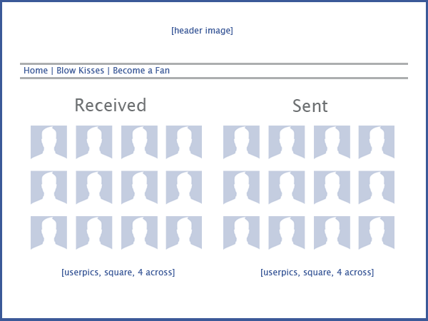
I encourage you to actually draw these screens and boxes out on paper, or in your favorite graphics program. It won’t take long, and will be a huge help in thinking through the interface and making sure you’re writing the app in a way that will make sense to the user. The mockups (often called wireframes) don’t have to be complicated or pretty, but they should roughly represent all of the key interface elements in position and placement.
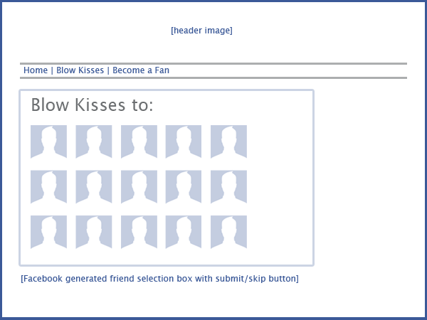
Our application is very simple, so we only have two main screens: the homepage that will display the incoming and outgoing kisses, and the page that allows the user to pick from a list of their friends and blow kisses to them. A more complicated application could require a dozen or more screens, with each screen representing a page of functionality within the app.
Canvas page (displays recent kisses, sent and received)

Send kisses page

As we’re creating these wireframes, it becomes easier to figure out where newsfeeds and app-generated emails will be most useful.
One the canvas page, the page listing incoming and outgoing smooches, the user isn’t taking any direct action, so there is no direct newsfeed trigger for newsfeeds or emails. The blow kisses page is a good place for both.
When the user blows someone (or several someones) a kiss, it should trigger a newsfeed item: “<user> has blown <recipient> a kiss!” Because of the rule that the user has to directly trigger the newsfeed item, it would NOT be permitted to also add a newsfeed item into the recipient’s newsfeed such as “<recipient> has received a kiss from <user>”. You could trigger that second newsfeed item when the user picks up their kiss though, since the user (in this case, the recipient) took direct action with the application. This may seem like nuance, but its important to understand the difference in order to remain compliant with Facebook’s terms of service.
The recipient should then receive an email notification letting them know someone has blown them a kiss. If the user has not yet allowed the application and agreed to let the application send them emails, they will not receve this notification, however, so its not a form of communication you should rely on.
Another Example
As I have mentioned, this application is extremely simple. It was designed to be simple to keep the coding part (coming soon, I swear) simple – but it doesn’t give us the opportunity to really demonstrate places where newsfeeds will serve you best in your application.
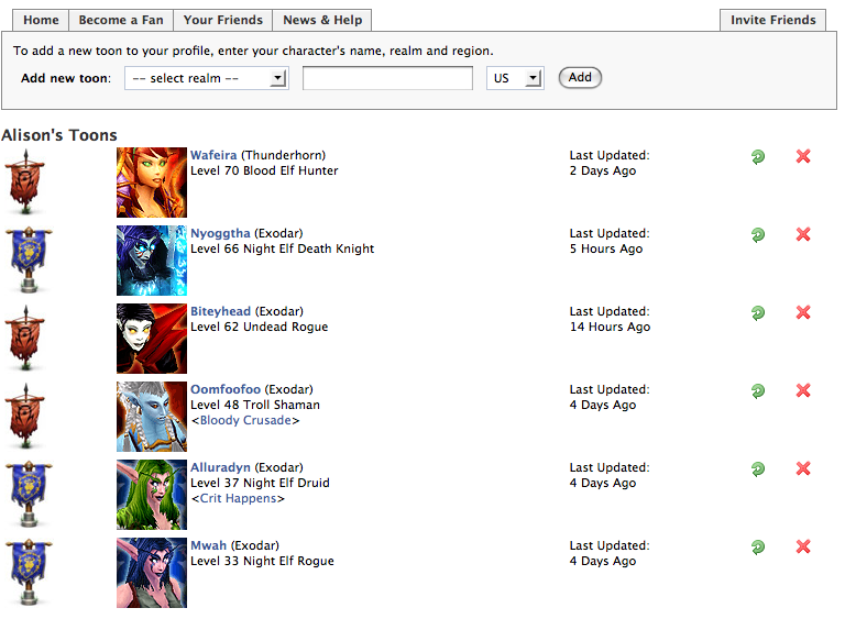
Another application I wrote (which is a work in progress) might be a better example. The WoW Toons application, which is a simple application that allows users to display their World of Warcraft characters on their profile, has a few more potential interaction points.
Canvas Page: Displays the user’s current WoW characters (also known as ‘toons’) with level, race, class, etc. It also contains the functionality for the user to force an update to their character, so if they have gained a level, the app will reach out to the WoW database and fetch new data. It then compares the newly fetched character level with the one stored in the database, and if the new level is higher, it updates the database AND triggers a newsfeed item: “<user> has reached level <level> on <pronoun> <race> <class> – Ding!”
When a user adds a new character to their profile, a newsfeed item gets inserted: “<user> has added their level <level> <race> <class> to their Warcraft Toons profile”
Newsfeeds also allow you to add an action item link (although its small and arguably not that noticeable.) For the Blow Kisses app, a “Blow <user> a Kiss Now” link with a link to the WoW app would be appropriate. For the WoW Toons app, something like “Add your own Warcraft toons now” link makes sense.

The WoW database also provides data on specific gear (armor, weapons, pvp stats, etc), and although I don’t currently track that data (might tho), when a user refreshes their gear, it would be appropriate to add a newsfeed item for new weapons, stats, etc. “<user> has reached 1045 pvp kills”.
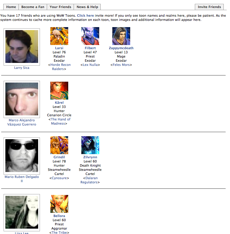
Your Friends Toons Page: In the WoW Toons application, you can see a listing of the toons for your friends who have added the app.

One possible feature that could be added would be to show the “last updated” date on this page, and allow users to “nudge” their friends if the friend in question hasn’t updated their characters recently. “<user> has nudged <recipient> to update <pronoun> Warcraft toon.”
In the Mr. Right application mentioned in the first article, we wanted to use newsfeeds to show the gifts that Mr. Right (a fictional boyfriend avatar) has sent the user. Because it is not allowed to automatically generate newsfeed items that a user has not triggered, we had to change the app to let the user click on a button labeled “Send me a Gift”. Since the user took direct action by clicking the button, we were able to insert a newsfeed item: “<user> has received a <gift name> from Mr. Right.” The action text was then “Get your own Mr. Right now”, linking to the application.

The above is an example of the short story newsfeed format. “Alison received a puppy from Mr. Right” is the headline, and then the short story body contain the image and additional text.
Conclusion
I’m sure I sound like a broken record by now, encouraging you to take the extra time to create wireframes and plan out every part of your application before you start coding. I promise you that it will be worth it in the end – you will end up with a better application that users will find easier to use and that more effectively uses the social parts of the social networking platform. I have personally cut corners and skipped this part too often – its so tempting. “Oh, I know what its supposed to do. Its a simple application.” And it never, ever is as simple as it first seemed.
Coding comes next, so be sure to subscribe to our RSS feed to make sure you don’t miss the next part in this series, where we walk through creating a simple Facebook application based on the dicussion in this article.