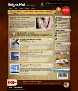
Jan 8, 2009 Update: Most of the bugs are worked out – I still need to refine the comments a little more – they’re a bit blah at the moment, and I have to build in the threaded comment code. To those who have taken the time to let me know what they think of the design, thank you! Your feedback has been great!
Jan 6, 2009 Update: The redesign is live, although there are a few bugs that need to be worked out, specifically with the comments display. Commenter’s gravatars, website info and name are currently stacking incorrectly. This should be fixed in the next day or so, and it will not prevent you from commenting normally.
Original Post:
Snipe.Net is undergoing some structural and design changes over the next week or so. No content has been removed, so if you can’t find what you’re looking for, try using the search or using the updated categories at the top of the page.
I’m sorry for any inconvenience this may cause, and hopefully this type of thing shouldn’t have to happen again anytime soon.
Why the Category Changes?
I had created the main navigation when I had first resurrected the blog, and it wasn’t until some time had passed that I realized that although those categories were perfectly fine for older posts, the way I blog, and the things I blog about, have changed over time. Rather than trying to retro-fit new posts into categories that didn’t really make sense anymore, I decided to do the cleanup now, cram the older posts into the best fitting category, and move forward.
I’m also working on a new site design, which is what really solidified the fact that the categories I was previously using just didn’t sense anymore. While its still very much a work in progress, you can get a sneak peek at the new design. I’d love to hear any thoughts you might have on it.

Why the Redesign?
Several people have asked me why I’m redesigning the site – “the current design is just fine”. It is – but it’s not mine. The current blog theme is called Papercut, and is a commercial theme from a company called WooThemes (that does beautiful work.) While its lovely, historically, snipe.net has always been designed by me – for better or for worse – so I have felt a little weird about using someone else’s design, even if I paid for it fair and square.
Plus, there were a few limitations to the design that always bothered me – I wanted a slightly wider content area, since many of my posts contain code. The new design should free up some space in the content so things aren’t quite so cramped.
I’ve had a bit of a dry spell from designing for a while. My day job is as a senior developer, not a designer, and at the company I work, I don’t get to do any design work at all. I sat down in front of Photoshop a few weeks ago and hit a groove. So, I’m in the process of slicing it up, writing the CSS and will be converting it into a WordPress theme soon so that I can make the switch.
With the new design will come a lot more free stuff of my own creation. I used to do that a lot on snipe.net, and I haven’t done it in a long time. I’m looking forward to it. 🙂